2023

Role
Product Designer — Redesign, Information Architecture, Prototyping, Interaction Design, UX Research
My team
PM - Nicole Chen
Product Designer -
Timeline
February 2023 - May 2023
Overview
Redesigning a legacy USDA platform to deliver modern usability, scalable systems, and executive alignment.
The USDA’s NAMP Platform had not been updated in decades, making modernization essential. We collaborated with internal developer teams and stakeholders in weekly design and strategy sessions, aligning on requirements and ensuring progress across all phases. In the final two weeks, I led design independently, creating a scalable design system and high-fidelity prototypes to support long-term usability. The work was presented to a cohort of 20 USDA executives, including the CIO leadership team, and received formal recognition through a letter of high praise.
CONTEXT
Yet despite its importance and legal requirements,
the USDA struggles to get users to work within the platform
Why is that?
ꜜ
PROBLEM STATEMENT
New and field-oriented staff grapple with considerable learning obstacles, leading to regular miscommunication and imbalanced task allocation. Moreover, experienced users also encounter inefficiencies stemming from the platform's design and procedural flaws.
How might we refine NAMP to accommodate both novice and experienced users, ensuring a streamlined, efficient, and user-friendly experience?
PROBLEM BREAKDOWN
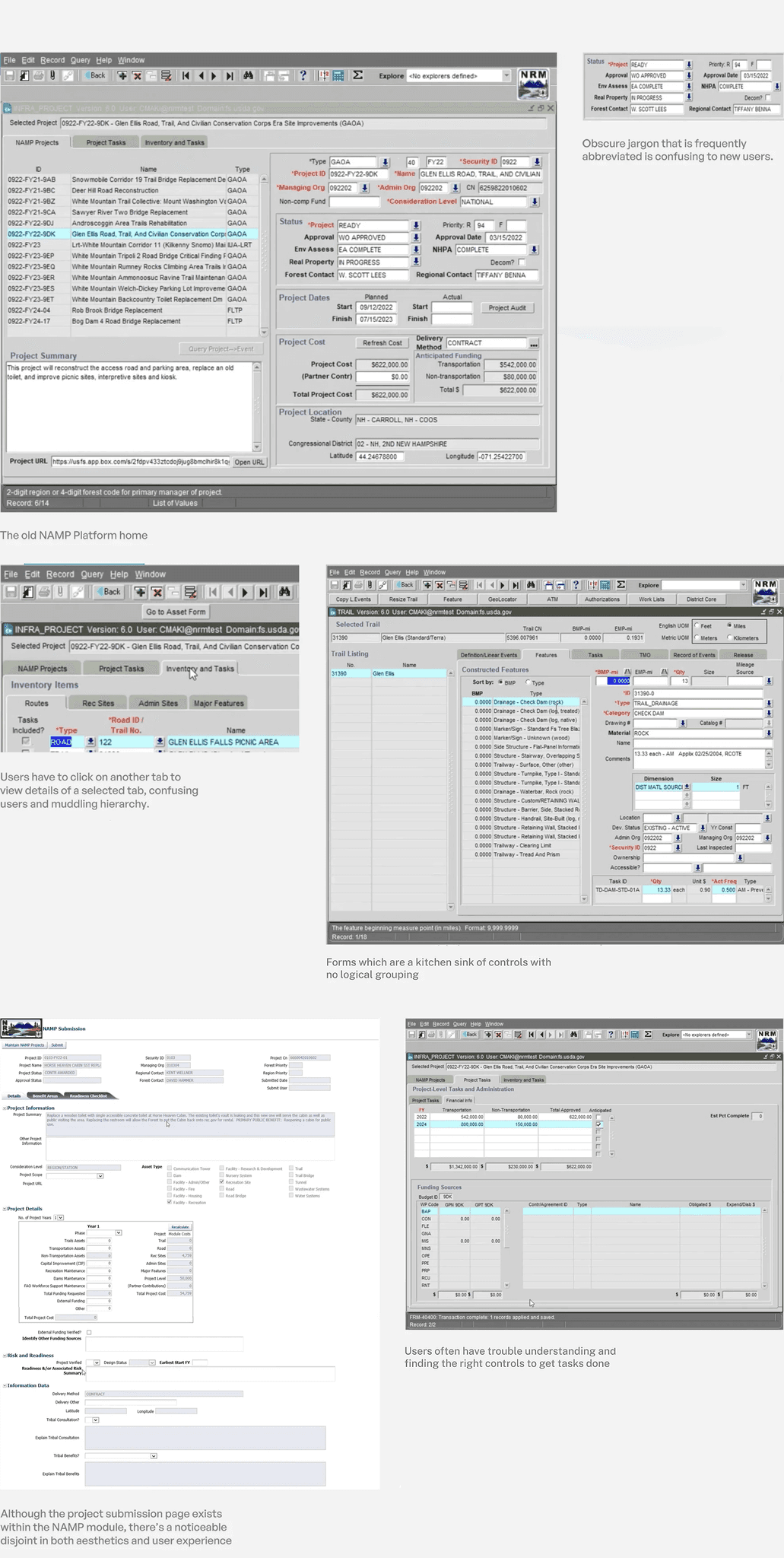
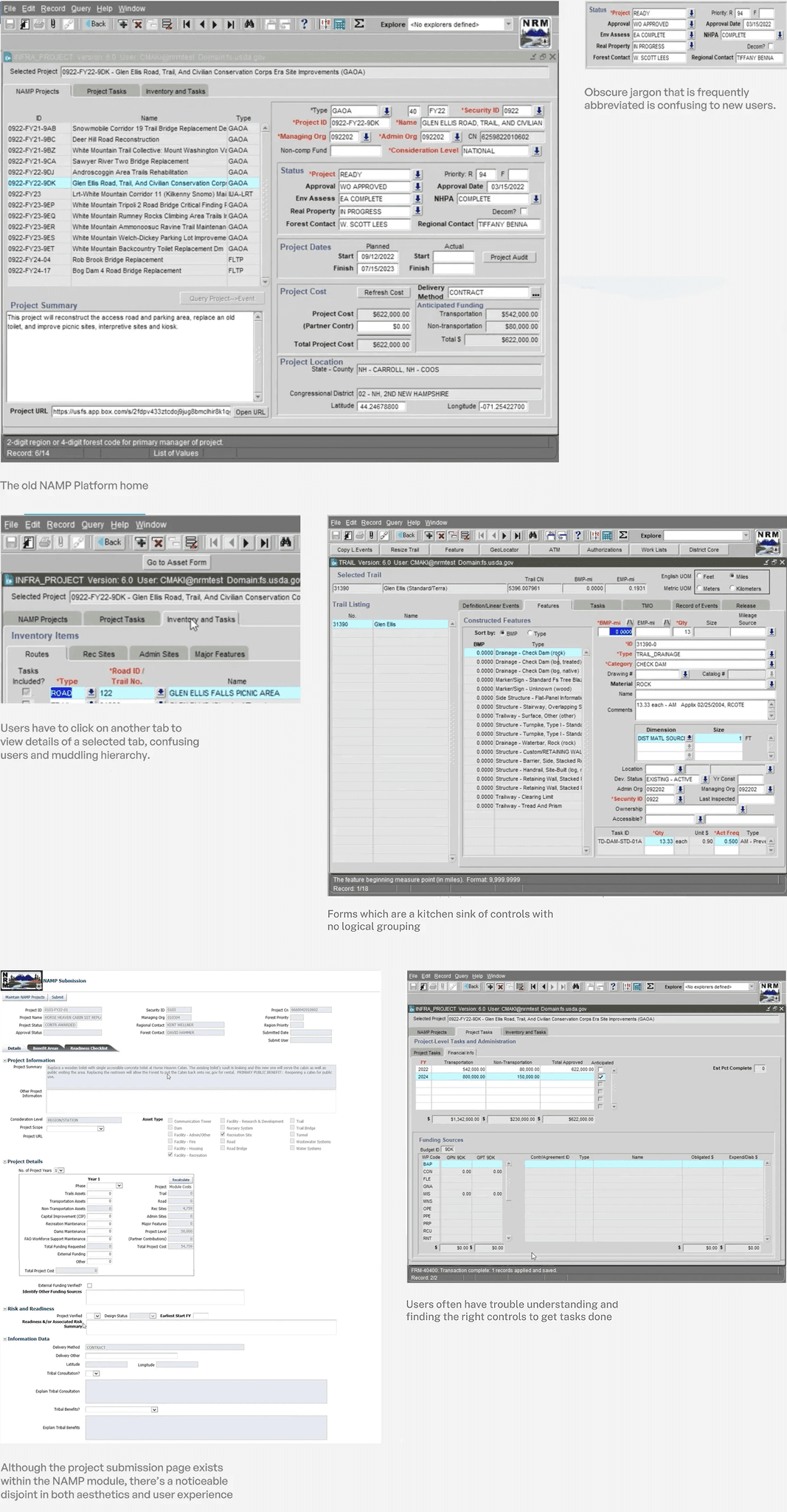
🐳 Breaks when scaled up to large volumes
The NAMP platform couldn't manage large data volumes, which is becoming the norm with the newly enacted law.
🤔 Complicated workflows with no IA
Most experiences over time became a kitchen sink of complex controls, with abstruse jargon in its copywriting.
🌲 Absence of hierarchy
The platform's overreliance of tabs for accessing detailed information hinders intuitive navigation and obscures content prioritization.
🖥 Dated user interface
The NAMP platform followed dated UI paradigms from an old tech stack, with critical usability issues.
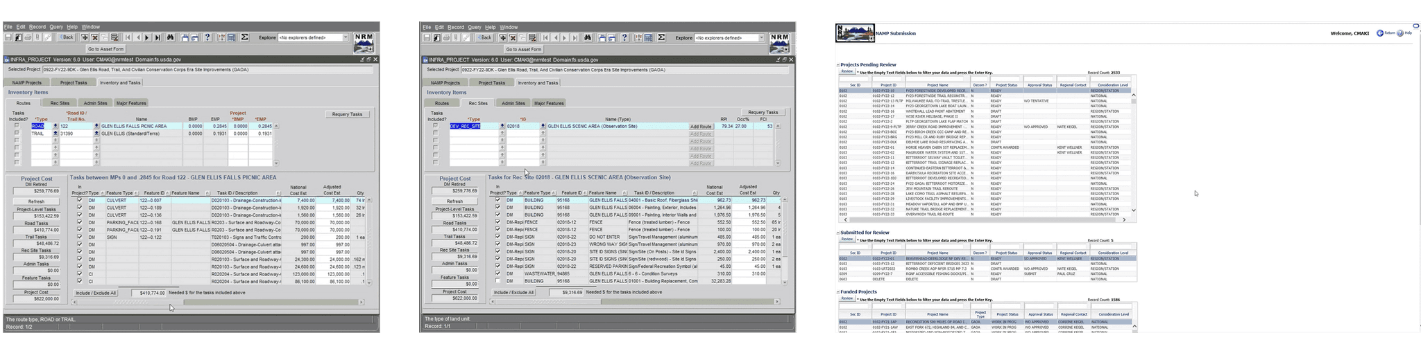
OVERVIEW OF OLD EXPERIENCE
USER RESEARCH
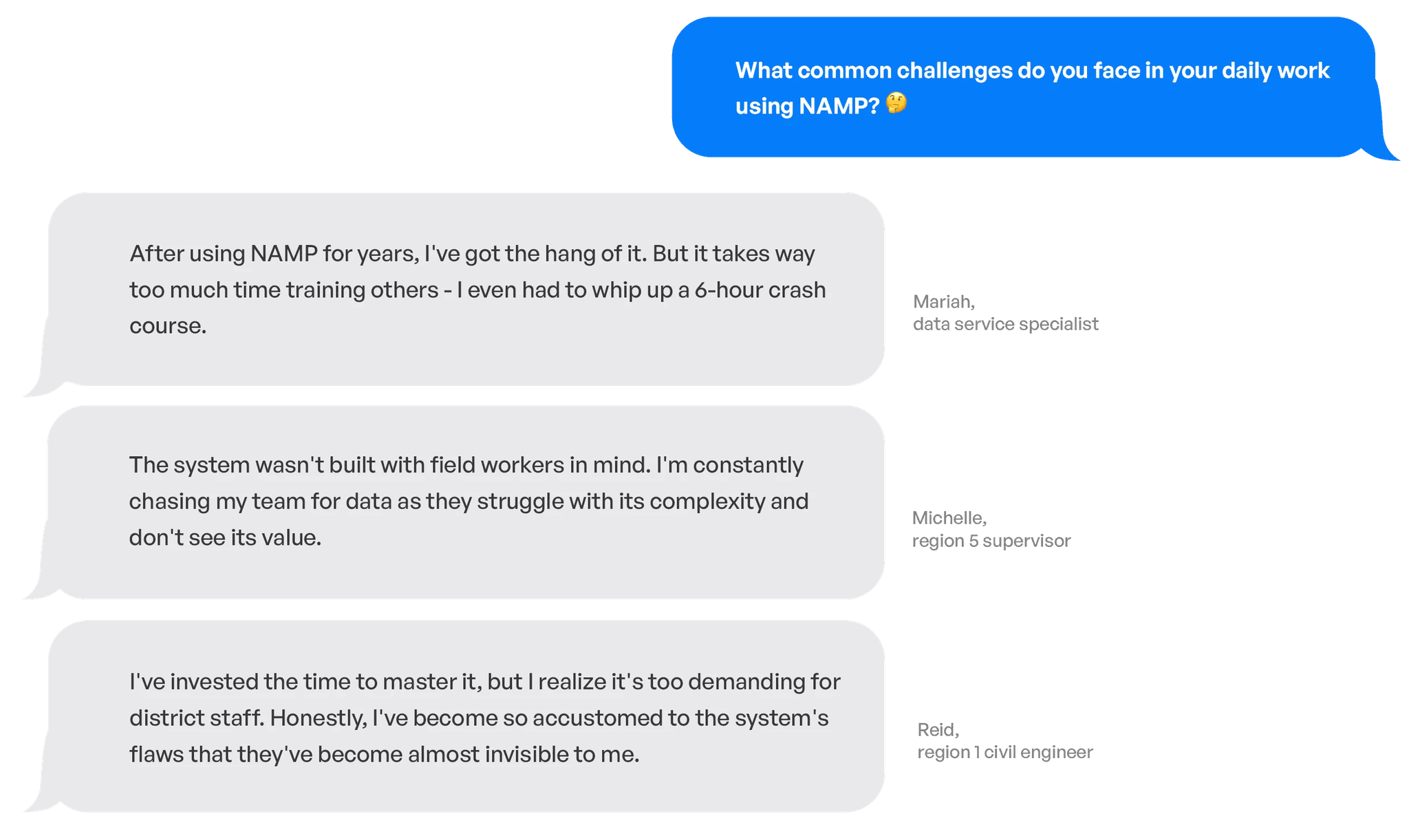
To further investigate and confirm the problem, I conducted ten 40-50 minute interviews with different users and stakeholders.
Through these interviews, we gained insight into client-specific information and research, supplanted limited access to the application, and highlighted how users approach platform.

Turning conversations into concrete insights
ꜜ
SYNTHESIZING RESEARCH
Affinity Mapping allows our team to collaboratively organize the info we received from user interviews and meaningfully analyze common themes in order to uncover key insights.
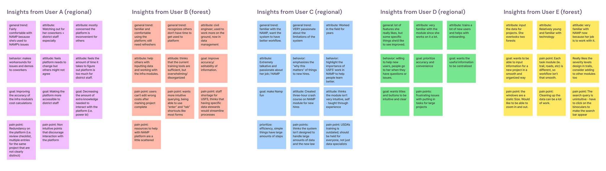
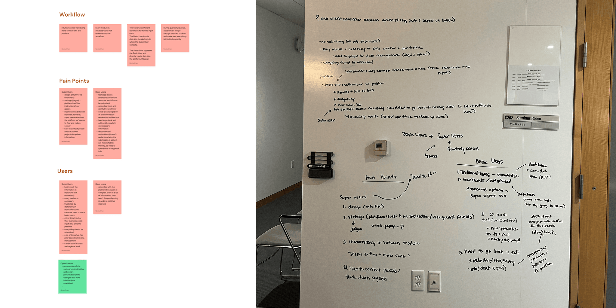
Some patterns we found through affinity mapping
ꜜ
KEY TAKEAWAYS
Our most significant finding was the pronounced disparity between the experienced and the inexperienced.
Most interviewees, with 10+ years of experience in NAMP are comfortable with the platform but recognize its complexity and overwhelming nature for others.
Other interviewees with no NAMP familiarity avoid the system entirely, leading to a significant task burden on the few experienced individuals.
Many interviewees pinpointed inaccuracy (of calculated costs), lack of editability, and disorganization as pain points.
All interviewees are eager to help others and subordinates learn how to use NAMP and realize its importance.
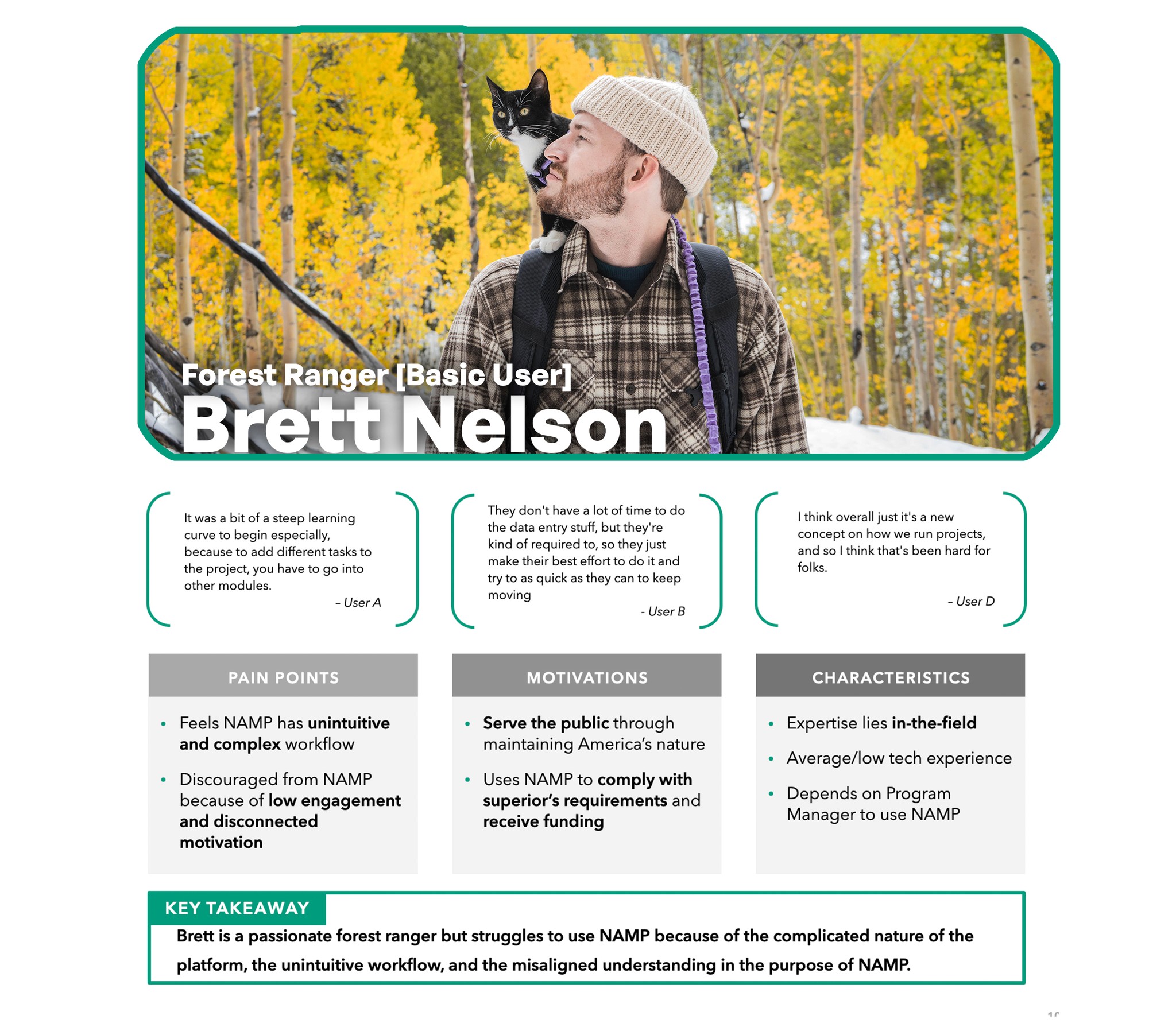
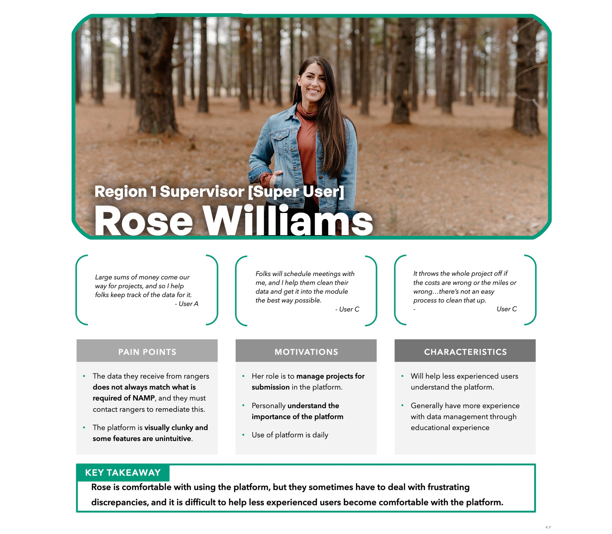
USER PERSONA
Consolidating our key insights into 2 personas.
APPROACHING A SOLUTION
Leveraging our key findings and persona attributes, our team devised a three-step redesign process:
We analyzed the existing user workflow and optimized it into a well-structured system architecture, ensuring the final design implementation reflected the improved process.
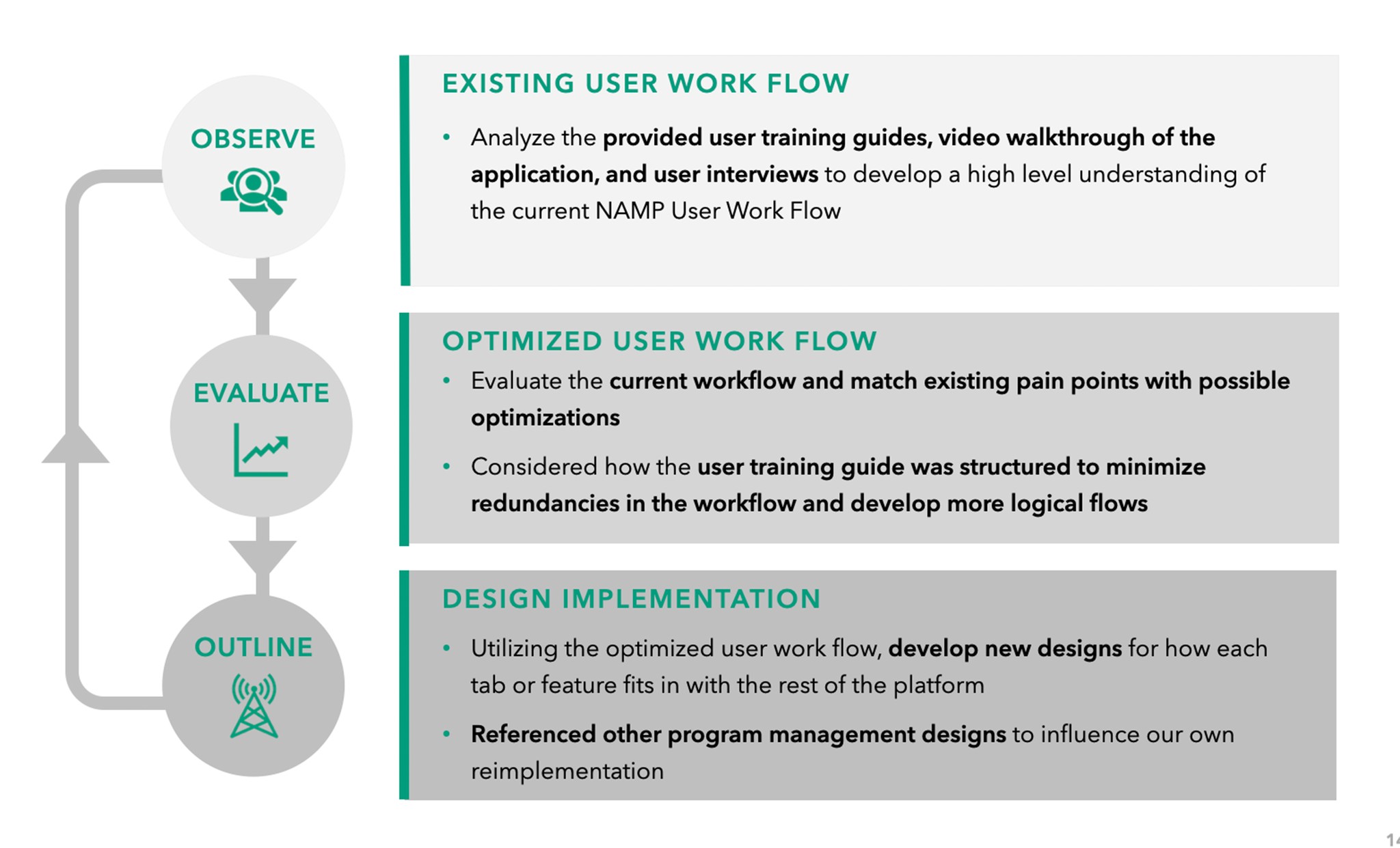
Design Goals
The research also helped us define our focus areas for the redesign.
Flexible
Adapt to various levels of information density across different user roles.

Simple
Clean out the clutter, and help users easily complete their tasks.
Coherent
Focusing on workflows rather than silos of information.
USERFLOW
Through detailed mapping of the current user journey, we set the stage for optimizing the workflow with streamlined steps.
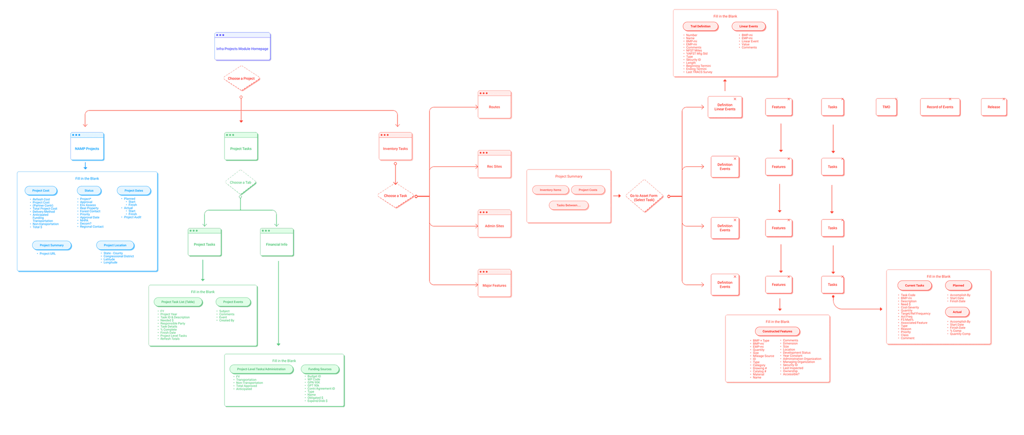
Creating a more intuitive user journey…
ꜜ
KEY TAKEAWAY
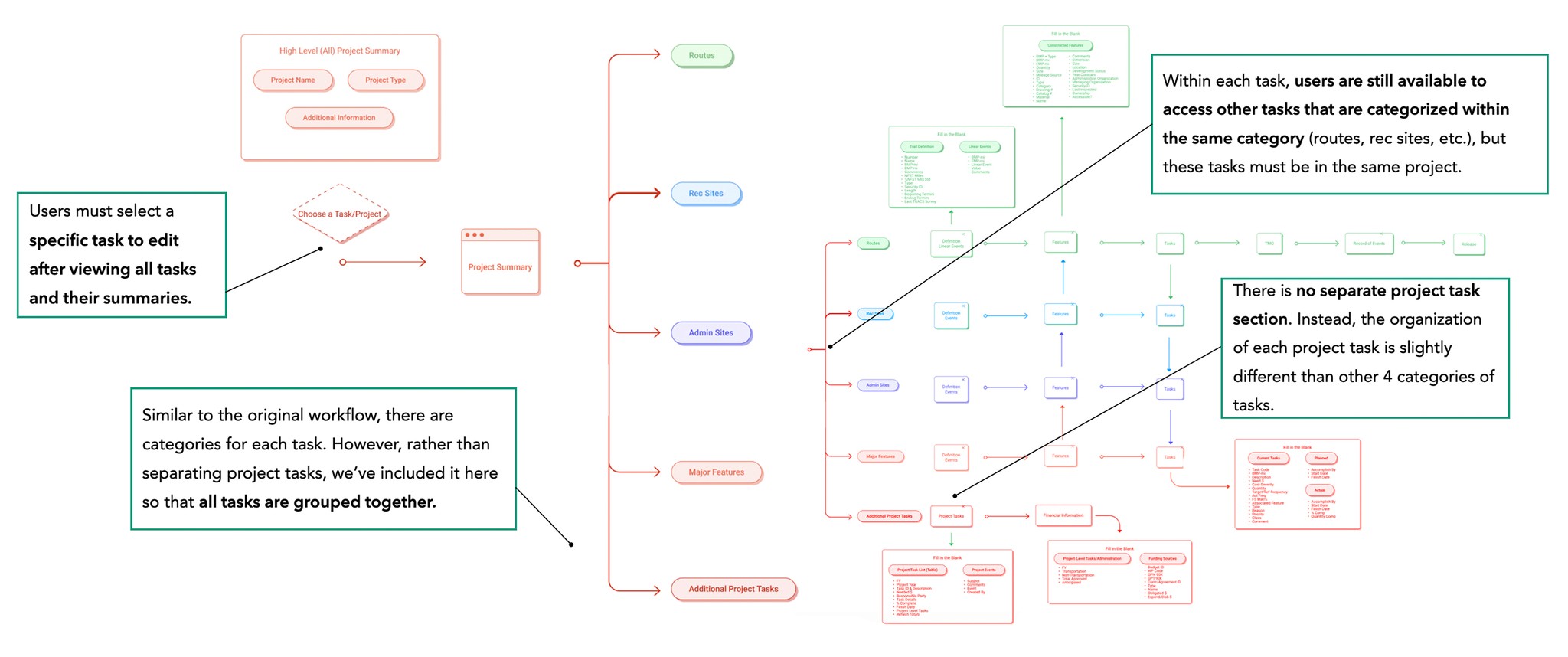
⚒️ Project-Task Hierarchy
Tasks are nested exclusively within their associated project such that to access is restricted to a project selection first then task selection second flow
Additional Tasks not categorizable into routes, rec sites, etc. are hierarchically placed on the same level as other tasks, as they are all nested within a project
🗂️ Task-to-Task Organization
All tasks nested within the same project are accessible to view from the current task page to facilitate for a task-focused experience
A navigation bar on the side of the screen enables for users’ quick and easy access to other tabs and pages
Consideration for our persona's context directed a user flow focusing on intuitive hierarchy.
While prioritizing hierarchy and intuitiveness, we ensured minimal disruption for superusers familiar with the existing layout.
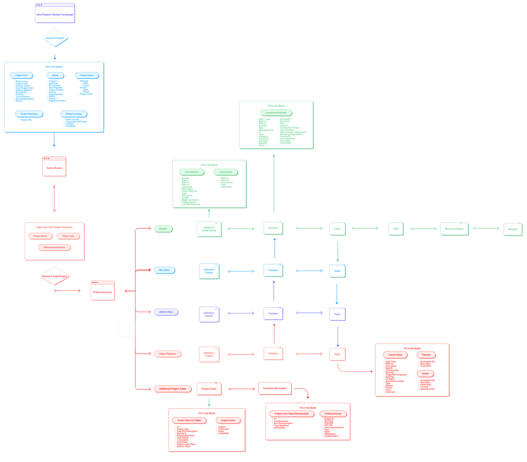
SYSTEM ARCHICTECTURE
USERFLOW
Building a low-fidelity prototype to conduct usability tests
How can we improve on the prototype?
ꜜ
USER RESEARCH
5 rounds of moderated tests informed iterations that helped refocus hierarchy and navigation.
We asked participants to complete scenarios while observing their movement patterns, mental models, and goal completion. Multiple feedback rounds informed key improvements to our low-fidelity prototypes.
SOLUTION
Final Prototype: Highlights
DESIGN GOAL: SIMPLE
Streamlining and simplifying the platform's organization
USER SCENARIO
NAMP serves as a handy tool for users, able to manage all forestry projects within our country. But with no organization and confusing copy users struggle to find what they're looking for.
SOLUTION
We improved the IA with logical groupings, clearer copy, and simplified navigation to create a more intuitive user experience.
DESIGN GOAL: COHERENT
Consistent UI styles across the entire platform
PROBLEM
From font sizes to buttons, the old platform’s inconsistent style guide created fragmented visuals, confusing cues, and a disjointed user experience.
SOLUTION
We built a unified style guide to standardize visual cues and create a cohesive, intuitive user experience across the platform.
DESIGN GOAL: FLEXIBLE
A customizable project table with filters and sort options.
USER SCENARIO
Users who manage and supervise on-going projects everyday, have to scan across large volumes of projects. Finding what you need can take a lot of time and effort.
SOLUTION
With different options to view and search through projects, users can quickly customize to the exact view of the table they need.
DESIGN GOAL: INTUITIVE
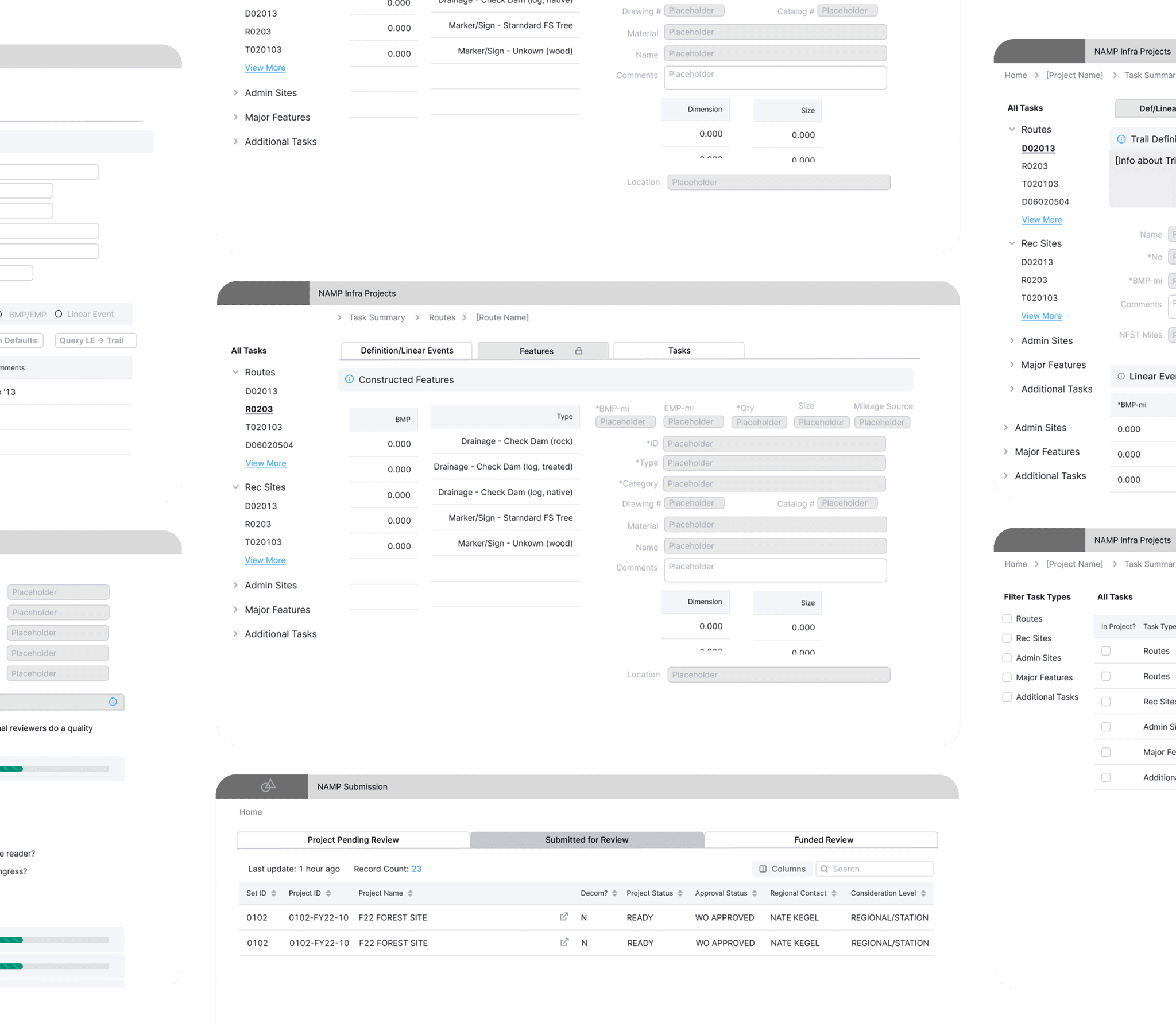
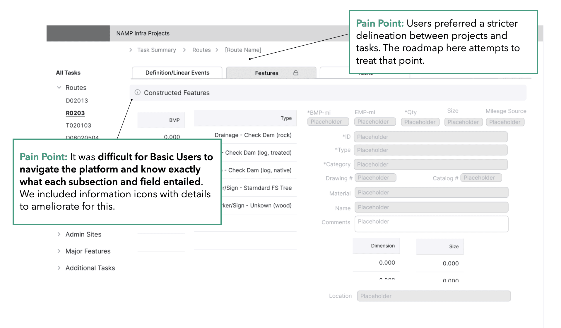
Creating clear distinctions in hierarchy between projects and tasks
USER SCENARIO
The old platform used tabs to access project tasks, but this misled users: tabs suggest parallel hierarchies, creating structural confusion.
SOLUTION
We expanded the table view with a side peek for quick project details and added a “View Project Tasks” button to clearly separate projects from their tasks.
DESIGN GOAL: SIMPLE
Swift navigation through breadcrumbs
USER SCENARIO
Because NAMP processes diverse data, its multi-page flow often left users disoriented—uncertain of each page’s purpose or how to navigate back.
SOLUTION
We created breadcrumbs to help users understand their current location within the platform and effortlessly retrace their steps, reducing confusion and enhancing usability.
DESIGN GOAL: FLEXIBLE
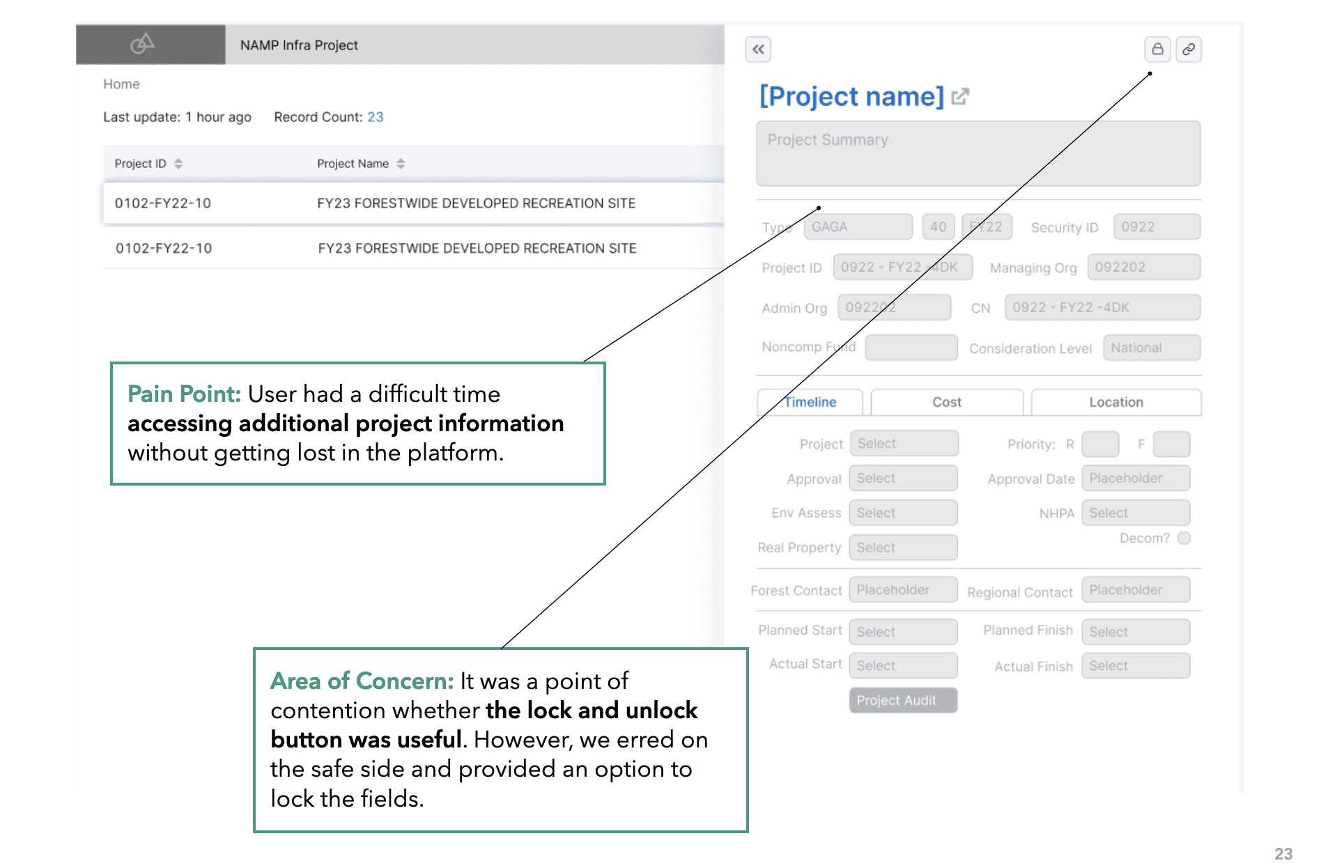
Information popup to guide new users
USER SCENARIO
NAMP’s vast data created a complex multi-page flow, often leaving users disoriented, unclear on page purpose, and unsure how to backtrack.
SOLUTION
To ease onboarding, we added contextual popups on key sections. These clarified industry-specific terms and complex metrics, helping new users quickly understand the platform and navigate with confidence.
DESIGN GOAL: FLEXIBLE
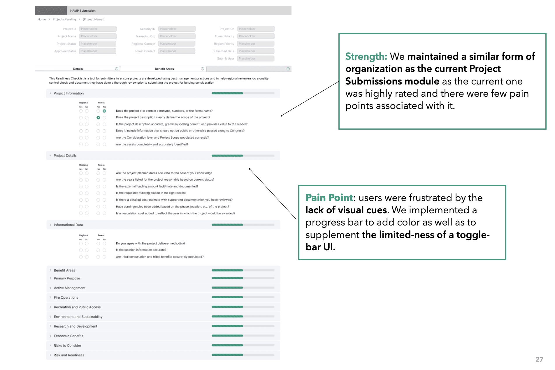
Features mirror the old platform to adapt to seasoned users
We kept the familiar tab layout while adding intuitive elements and tooltips, making navigation easier for new users without disrupting experienced ones.
DESIGN GOAL: FLEXIBLE
Navigating between tasks through sidetabs
As users frequently work within various tasks, we added a sidetab for easy navigation within the tasks.
DESIGN GOAL: FLEXIBLE
Clear distinction between view & edit mode
This distinction is essential to prevent inadvertent changes or mistakes, ensuring users are aware of their actions on the platform.
PROJECT TAKEAWAYS
In redesigning an application, it’s easy to assume that piling on new features will improve the experience. In reality, unnecessary additions can overwhelm users, dilute core functionality, and create friction instead of value.
While basic users might appreciate a more intuitive and simplified approach, super users, especially those acclimated to the original platform, can find drastic changes disruptive. It's a delicate balance to strike. This experience has taught me the importance of a holistic user-centric design approach. Before making significant changes or introducing new features, it's crucial to gauge the needs and habits of all user groups. Change for the sake of change can be detrimental. The key is to evolve a platform while ensuring it remains accessible and efficient for both new and veteran users.